[PT-BR]
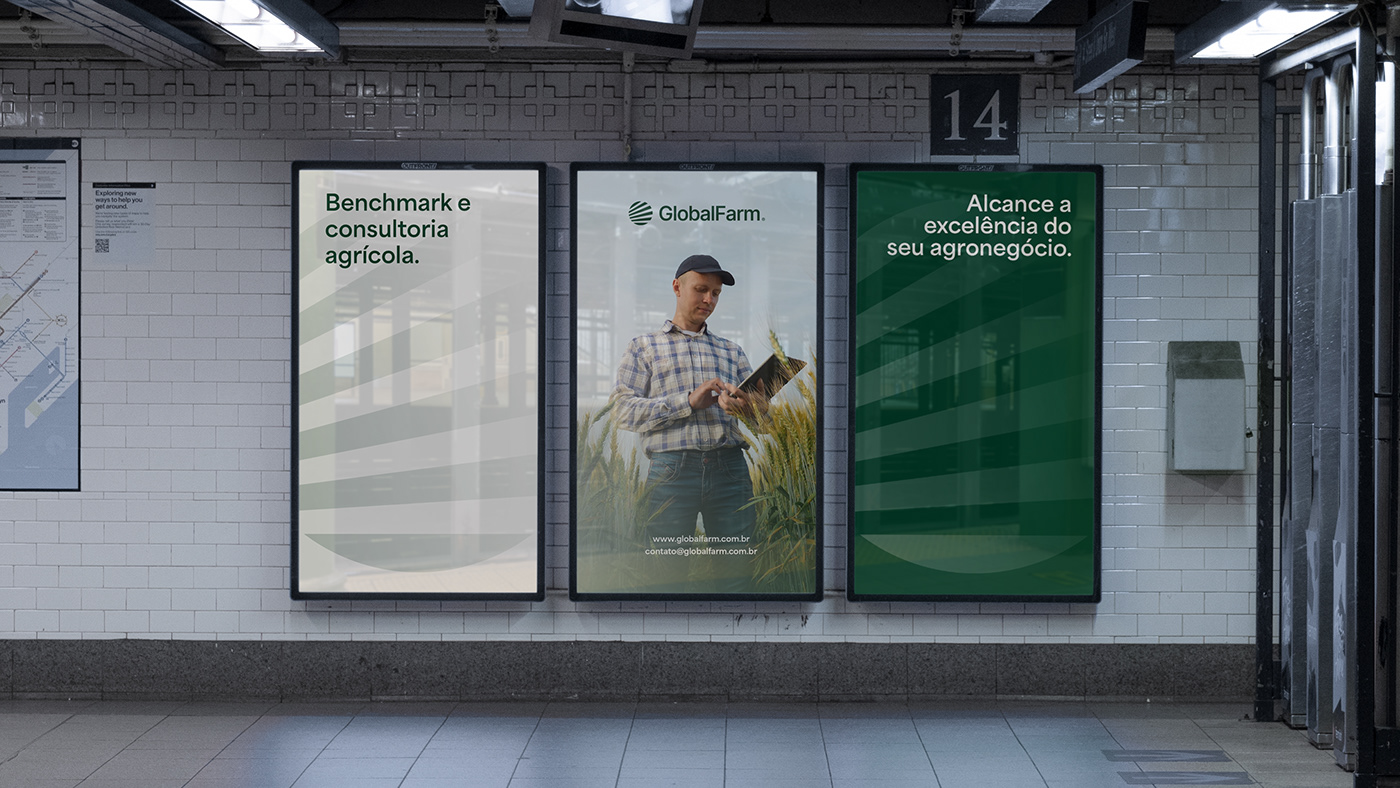
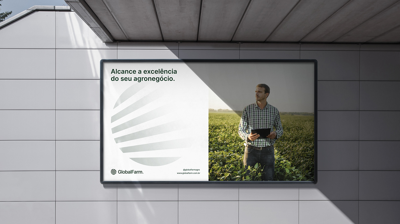
Alcance a excelência do seu agronegócio.
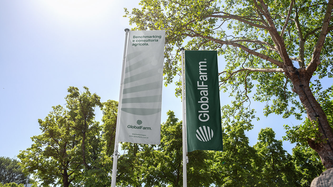
A GlobalFarm é uma empresa de benchmarking e consultoria agrícola. Sua missão é trazer conhecimento para os grandes produtores e empresas rurais, oferecendo soluções eficientes para auxiliar na gestão e melhorar o desempenho de agronegócios.
Durante sua história, a empresa se consolidou como uma referência no benchmarking agrícola, acumulando quase uma década de experiência no mercado. No entanto, com o passar do tempo, tornou-se evidente a necessidade de um redesign de sua identidade visual, que já não refletia a liderança e expertise conquistadas ao longo dos anos.
-
[EN]
Agribusiness excellence.
GlobalFarm is an agricultural benchmarking and consulting company. Its mission is to bring knowledge to large producers and rural companies, offering efficient solutions to help manage and improve the performance of agribusinesses.
During its history, the company has established itself as a staple in agricultural benchmarking, accumulating almost a decade of experience in the market. However, as time went by, it became clear that it needed to redesign its visual identity, which no longer reflected the leadership and expertise it had gained over the years.

[PT-BR]
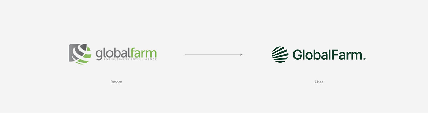
A antiga identidade da GlobalFarm apresentava características que não eram compatíveis com sua personalidade. As cores não transmitiam a imagem adequada, o símbolo passava uma aparência antiquada à marca e a tipografia em caixa baixa não eram coerentes com o profissionalismo e experiência que a empresa possui.
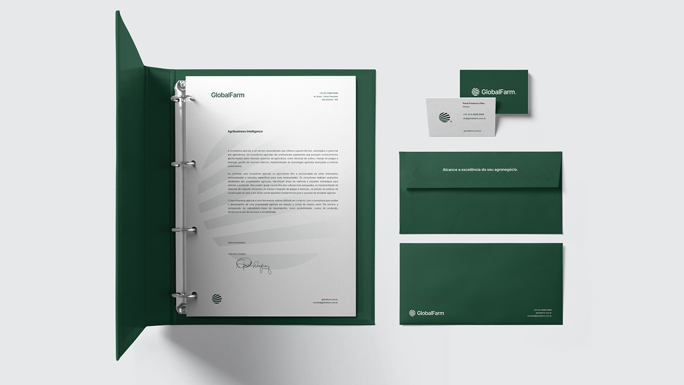
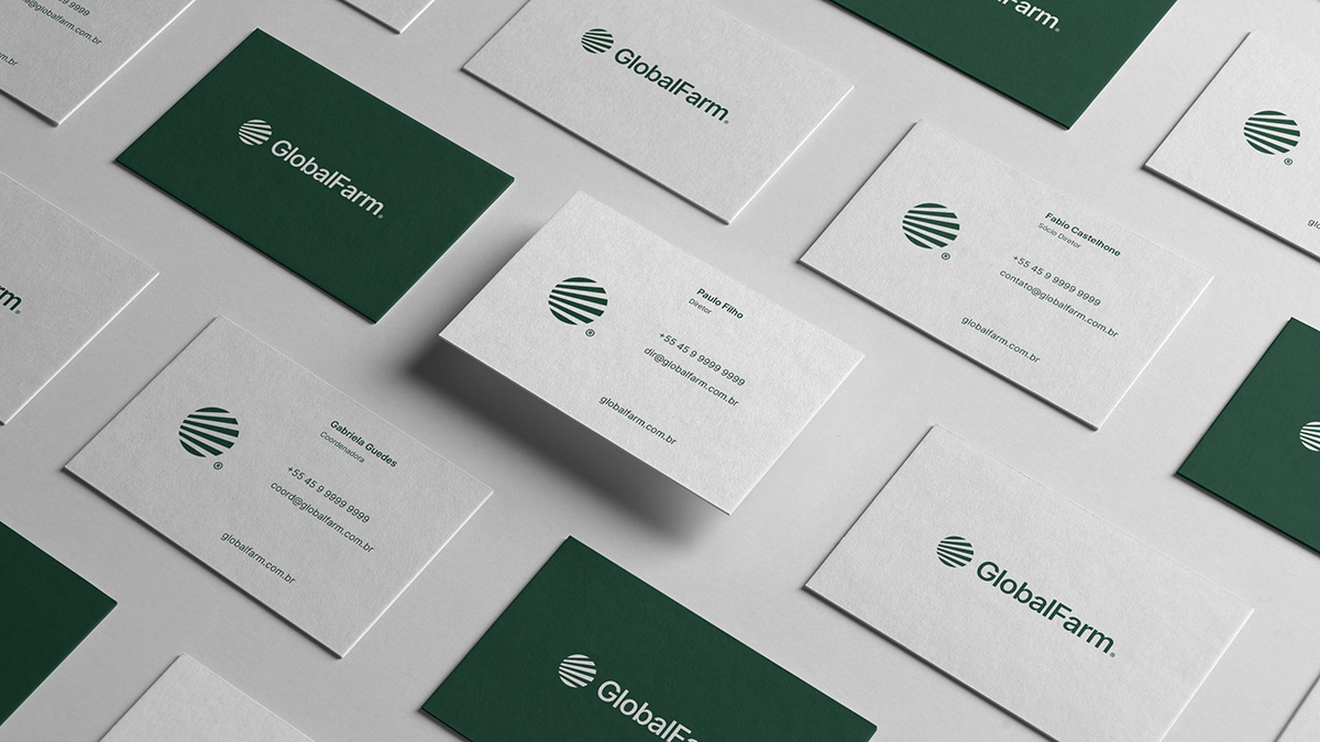
Optamos por conservar o esquema de cores antigo, porém com tons e proporções de uso atualizados. O verde escuro junto ao branco, busca criar uma atmosfera mais sábia e transparente para o sistema gráfico.
Para o logotipo, decidimos manter um vínculo com o legado e a história da empresa utilizando o mesmo conceito da versão antiga, permitindo que clientes e parceiros de negócios reconheçam facilmente essa nova identidade.
A nova assinatura da marca transmite uma mensagem clara. A simplicidade das formas refletem esse novo momento da empresa e ressaltam o desejo de evoluir sem perder de vista as raízes e valores originais da marca.
-
[EN]
GlobalFarm's old identity had characteristics that were not compatible with its personality. The colors did not convey the right image, the symbol gave the brand an outdated appearance and the lowercase typography was not consistent with the company's professionalism and experience.
We opted to keep the old color scheme, but with updated hues and usage proportions. The dark green together with the white seeks to create a wiser and more transparent atmosphere for the graphic system.
For the logo, we decided to maintain a link with the company's legacy and history by using the same concept as the old version, allowing customers and business partners to easily recognize this new identity.
The new brand signature conveys a clear message. The simplicity of the shapes reflects this new moment for the company and highlights the desire to evolve without losing sight of the brand's original roots and values.